【CSS练习】菜单图标
文章目录 代码实现
学习内容:
Day2
链接地址
【】Menu Icon: Used on every by now, but it a real eye-
【知识点】、、JS中的DOM操作、less预编译转义|循环
知识补充 Less 函数
选择器名、url中使用变量使用@{value}的形式,样式书写使用@value的形式
循环
each: 含有两个参数list、reles,将rules的规则绑定到list中的每一个成员;
css">@selectors: blue, green, red;each(@selectors, {.sel-@{value} {a: b;}
});
:
.sel-blue {a: b;
}
.sel-green {a: b;
}
.sel-red {a: b;
}
配合range()函数,可以实现for循环的模式
each(range(4), {.col-@{value} {height: (@value * 50px);}
});
转义
允许使用字符串作为属性或变量。任何~""形式的内容按原样输出。某些时候,当需要引入无效的 CSS 语法或 Less 不能识别的字符,就需要使用转义字符 代码实现
html
<div class="frame"><div class="center"><div class="menu-icon"><div class="line-1 no-animation">div><div class="line-2 no-animation">div><div class="line-3 no-animation">div>div>div>div>
css
// delete the following line if no text is used
// edit the line if you wanna use other fonts
@import url(https://fonts.googleapis.com/css?family=Open+Sans:700,300);@menu-icon-line-space: 14px;
@menu-icon-line-height: 8px;
@content-width: 70px;
@content-height: 3 * @menu-icon-line-height + 2 * @menu-icon-line-space;
@cubic-bezier-in: cubic-bezier(0.30,1,0.70,1);
@cubic-bezier-out: cubic-bezier(1,0.70,1,0.30);
// use only the available space inside the 400x400 frame* {box-sizing: border-box;
}.frame {position: absolute;top: 50%;left: 50%;width: 400px;height: 400px;margin-top: -200px;margin-left: -200px;border-radius: 2px;box-shadow: 4px 8px 16px 0 rgba(0,0,0,0.1);overflow: hidden;background: #3faf82;color: #333;font-family: 'Open Sans', Helvetica, sans-serif;-webkit-font-smoothing: antialiased;-moz-osx-font-smoothing: grayscale;
}.center {position: absolute;top: 50%;left: 50%;transform: translate(-50%,-50%);
}.menu-icon {position: relative;width: @content-width;height: @content-height;each(range(3), {  // each 遍历.line-@{value} {position: absolute;top: 50%;left: 50%;transform: translate(-50%, -50%);width: 100%;height: @menu-icon-line-height;background-color: #fff;border-radius: 10px;transition: background-color .5s ease-in-out;}}).line-1 {top: 0;}.line-3 {top: 100%;}&:hover {cursor: pointer;}
}
.active {each(range(3), {.line-@{value} {animation: ~'animate-line-@{value}' .7s @cubic-bezier-in forwards;}})
}
.no-animate {each(range(3), {.line-@{value} {animation: ~'animate-line-@{value}-rev' .7s @cubic-bezier-out forwards;}})
}@keyframes animate-line-1-rev {0% {top: 50%;transform: translate3d(-50%, -50%, 0) rotate(135deg);}50% {top: 50%;transform: translate3d(-50%, -50%, 0);}100% {top: 0;}
}
@keyframes animate-line-2-rev {0% {transform: translate3d(-50%, -50%, 0) scale(0);opacity: 0;}100% {transform: translate3d(-50%, -50%, 0) scale(1);opacity: 1;}
}
@keyframes animate-line-3-rev {0% {top: 50%;transform: translate3d(-50%, -50%, 0) rotate(45deg);}50% {top: 50%;transform: translate3d(-50%, -50%, 0);}100% {top: 100%;}
}@keyframes animate-line-1 {0% {top: 0;}50% {top: 50%;transform: translate3d(-50%, -50%, 0);}100% {top: 50%;transform: translate3d(-50%, -50%, 0) rotate(135deg);}
}
@keyframes animate-line-2 {0% {transform: translate3d(-50%, -50%, 0) scale(1);opacity: 1;}100% {transform: translate3d(-50%, -50%, 0) scale(0);opacity: 0;}
}@keyframes animate-line-3 {0% {top: 100%;}50% {top: 50%;transform: translate3d(-50%, -50%, 0);}100% {top: 50%;transform: translate3d(-50%, -50%, 0) rotate(45deg);}
}
js
window.addEventListener('load', function () {function judge(item) {return !item.contains('active') ? "active" : 'no-animate'}let menuIcon = this.document.querySelector('.menu-icon')menuIcon.addEventListener('click', function () {console.log(judge(this.classList));this.classList.toggle(judge(this.classList))console.log(this.classList);})
})
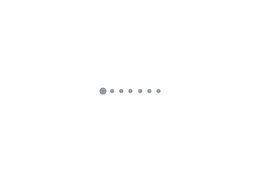
效果图
点击后,具有动画效果变化如下: