TS+Hooks二次封装antd Modal,实现可拖拽
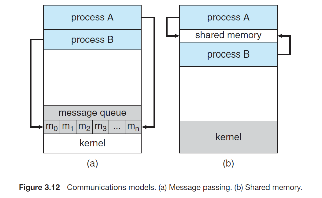
一、最终效果图
使用和React Hooks二次封装antd的Modal对话框,实现可拖拽效果,并且满足下面的小细节。最终效果图如下:
小细节: 拖动时鼠标于DIV的相对位置拖动时选中文字边界问题页面失去焦点销毁时回到原位
二、可拖动DIV
在实现Modal对话框拖拽的之前,可以在html页面上先实现一个可拖动的DIV,我是学习了这篇文章可拖动DIV。里面的具体原理细节可以参考这篇文章。
直接通过图的方式表达可能更加直观。主要就是要确定好相对移动距离和边界条件。我的在线测试DEMO
三、封装 1. 实现原理 有部分参考了这篇文章,antd Modal的class属性是ant-modal-,通过这个属性,获得Modal对话框具体左右视图边框的距离和,用于后续的定位。
相对移动位置
var cx = e.clientX - startPosX + styleLeft,cy = e.clientY - startPosY + styleTop;
Modal对话框位置再次点击更新
这里的132就是Modal高度的一半,为了让他销毁后每次都保持在视图中央。如果自己改变宽高度的话,可以再次封装style中的width,就不至于写死了。因为Modal组件关闭的时候,是不会自动销毁的,如果不写下面的代码,会导致再次点开Modal后,还是上次那个位置。这个地方写的不太好,继续优化。
useEffect(() => {return () => {setStyleLT({styleLeft: 0,styleTop: window.innerHeight / 2 - 132})setFlag(true);}}, [props.isModalVisible])
2. 组件代码
import { Modal } from 'antd';
import { useState, useEffect } from 'react';interface ModalBoxxProps {title: string,isModalVisible: boolean,handleOk: any,handleCancel: any,children?: React.ReactNode,okText?: string,cancelText?: string
}
let content: HTMLDivElement, contentLeft: number = 0, contentRight: number = 0;const ModalBox: React.FC<ModalBoxxProps> = (props) => {const [styleLT, setStyleLT] = useState({styleLeft: 0, styleTop: window.innerHeight / 2 - 132});let [flag, setFlag] = useState<boolean>(true);const style = { left: styleLT.styleLeft, top: styleLT.styleTop }useEffect(() => {return () => {setStyleLT({styleLeft: 0,styleTop: window.innerHeight / 2 - 132})setFlag(true);}}, [props.isModalVisible])const onMouseDown = (e: any) => {e.preventDefault();if (flag) {content = document.getElementsByClassName("ant-modal-content")[0] as HTMLDivElement;contentLeft = content.getBoundingClientRect().left;contentRight = content.getBoundingClientRect().right - content.offsetWidth;setFlag(false);}// 记录初始移动的鼠标位置const startPosX = e.clientXconst startPosY = e.clientY;const { styleLeft, styleTop } = styleLT// 添加鼠标移动事件document.onmousemove = (e) => {var cx = e.clientX - startPosX + styleLeft,cy = e.clientY - startPosY + styleTop;if (cx < -contentLeft) {cx = -contentLeft;}if (cy < 0) {cy = 0;}if (cx > contentRight) {cx = contentRight;}if (window.innerHeight - cy < content.offsetHeight) {cy = window.innerHeight - content.offsetHeight;}setStyleLT({styleLeft: cx,styleTop: cy})} // 鼠标放开时去掉移动事件document.onmouseup = function (e) {document.onmousemove = nullif (e.clientX > window.innerWidth || e.clientY < 0 || e.clientX < 0 || e.clientY > window.innerHeight) {document.onmousemove = null}}}return (<Modaltitle={<divclassName='dragBoxBar'style={{ height: "100", width: "100%", cursor: 'move', userSelect: "none" }}onMouseDown={onMouseDown}>{props.title}</div>}visible={props.isModalVisible}onOk={props.handleOk}onCancel={props.handleCancel}style={style}wrapClassName='dragBox'okText={props.okText}cancelText={props.cancelText}>{props.children}</Modal>)
}export default ModalBox;
4. 组件调用
import { Button } from "antd";
import { useState } from "react";
// 引入组件
import { ModalBox } from "../Components";interface ListProps {name?: string,age?: number
}
const List = (props: ListProps) => {const [showModal, setShowModal] = useState<boolean>(false)const handleModal = () => {setShowModal(true);}const handleOk = () => {setShowModal(false);};const handleCancel = () => {setShowModal(false);};return (<><div>列表页组件</div><ModalBoxtitle="告警信息"isModalVisible={showModal}handleOk={handleOk}handleCancel={handleCancel}okText="确定"cancelText="取消"><p>告警</p><p>告警</p><p>告警</p></ModalBox><Button onClick={handleModal}>点击弹窗</Button></>)
}
export default List;
四、总结
Modal每次消失的时候,不太流畅,需要再次优化,如果有好的建议,希望能和我一起交流。(* ̄︶ ̄)